Saturday, January 29, 2011

Creation of Adam

OK... So I said I'd be posting a portrait a week. And hopefully I'll finish the piece I'm working on by tomorrow. 


So there you are, rolling your eyes, saying to yourself,"He's slacking already!" But before you jump too quickly, the reason I'm late with this week's portrait is that I've been given an invitation to hang and sell my work in a gallery here in Connecticut. Other than my thesis presentation, I've never had a gallery show. I'll be posting more details about it later. Here's a link to the gallery.


In lieu of a new portrait, allow me to share an image I created for a book cover. The challenge was to portray God seeing Himself in His own creation. While taking a drive to get some coffee, clear my head, and find some inspiration, the thought occurred to me that Genesis tells us Adam was created in God's image, and that he was fashioned from the dust of the ground. I bought my coffee (priorities!) and headed off to the nearest Home Depot to buy a couple bags of potting soil.


Layering the floor of my studio with cardboard and newspaper, I emptied the bags, moistened the soil and began to sculpt.


I photographed the final sculpture and began to play in Photoshop. The final portrait below illustrates the creation story with the shoulder being formed out of the ground, the face taking shape and then turning to flesh after God breathed His Spirit into him. 


I hope you find this portrait inspiring. And I promise to have my next image up soon.

Saturday, January 22, 2011

A year of portraits...

It's been 6 months since I graduated with my MFA. And sadly it's been at least that long that I've failed to pick up my pencils or watercolors. I've never been one of those artists who just draws all day long... I need a project with deadlines and some accountability. So I either go for years of counseling to dig into my past and find out why, or I just give myself a project and give myself a reason to keep my feet to the fire. Call me a coward, but I chose the project.


We were visiting friends last week, and I was talking about this with their daughter, Rachel– a lovely, gifted young lady who has the makings of fine photographer. She was pouring out the same lament to me, that working full time has kept her from challenging herself more. So, right there at the dinner table we committed to posting a piece a week on our respective blogs. She will post a photograph, I will post a portrait. If you ask me, she got the sweet end of the deal, but if keeping my commitment makes her better at her craft, then I'm up to the challenge.


Since I've never done a portrait of my youngest daughter, Emma, I decided that would be a great start. For those of you who may not know, you can click on the image for a larger version.


So here's my first of 52 portraits. I ask you, dear reader, to prod and push me as well. And please encourage Rachel as she endeavors to grow creatively.


Thursday, January 20, 2011

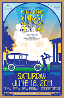
Klingberg Auto Show

I just completed a series of pieces to help promote the 2011 Klingberg Vintage Motor Car Festival. It was a tremendous honor and opportunity. The VP, Mark Johnson, is one of those delightful clients who knows when to give direction and when to let the artist play. And play I did, deciding to make use of Adobe Illustrator for almost all the art.

This is the second year that the show is running on Father's Day weekend, hence the father/son theme on the poster. The show is features rare and seldom seen antique vehicles, displaying about 500 antique automobiles from collectors in the Northeast. But more importantly, it serves as a fundraiser for Klingberg Family Center, raising funds for vital programs restoring and preserving families for children.

For more info about the show, visit www.KlingbergAutoShow.org.

The car featured on the front of the flyer
is a 1939 Delahaye Type 135M.

I couldn't resist drawing a 1959 Cadillac Eldorado
for the interior spread.

I had a lot of fun with the poster.
Designed for 3 formats, this one is 11" x 17".
The car is a 1914 Locomobile Berline Limousine.

Saturday, January 15, 2011

Create elaborate patterns from a single flower

Here's an easy way to create some beautiful patterns that could be used for fabrics, scarves, or just plain fun... all from a single image of a flower and some Photoshop magic. 
For this demonstration I chose a photo I have of a pansy, one of my wife's favorite flowers.

Isolate the image of the flower and place it on a separate layer in a new document. Drag guides from the top and bottom to mark the center of the document.

Fill the background with a color. I happened to choose green because... just because. You don't have to get deep and technical about this. You can play with and change colors to your heart's content. Then change the blending mode of the flower layer to Difference. 

Duplicate the flower layer 4 times, creating 5 identical layers. Select the four top layers,  select Edit => Free Transform, and drag the center point of the selection to the center of the document, at the intersection of the guides. Rotate the selection 72 degrees.

Repeat this process with the 3 top layers, then the top 2 and finally the remaining top layer. Create a group from all the flower layers. 

Duplicate the group. With the new group selected, select Edit => Free Transform, rotate the group 36 degrees, and scale and move the selection until it covers the background area.

Now for some fun. Add a Hue/Saturation adjustment layer above the background and play with the hue.

To take it a step further, experiment by changing the blending mode of the groups. You can see the variations by just changing the blending mode of the top group.
Each flower you use yields a unique image. Here's a sample of a pattern I created using an image of a snapdragon.
Have fun!  If anyone decides to use this tutorial I'd love to know how and where you applied it.

Wednesday, January 12, 2011

Views from the Second Floor

Here are some pics of the latest snowstorm here in Conneticut... taken from the safety of my studio and bathroom! Haven't seen it like this in years. Click on pics for a larger view...